Our mission is to cultivate the ability to turn raw, imperfect data into honest insight — to curate with rigour, visualize with judgement, and communicate what the data does and does not say, clearly and responsibly, across science, industry, and society.

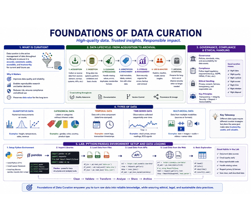
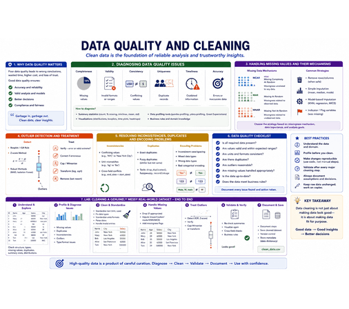
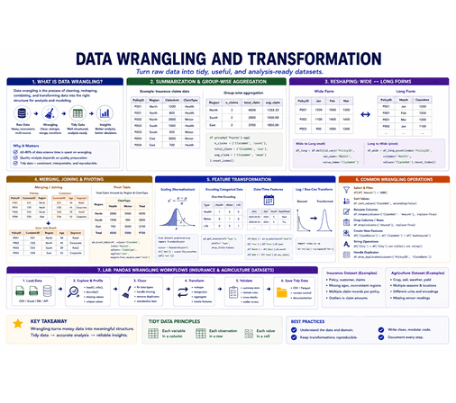
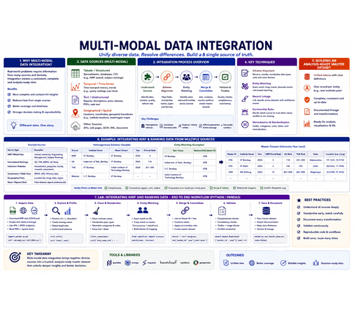
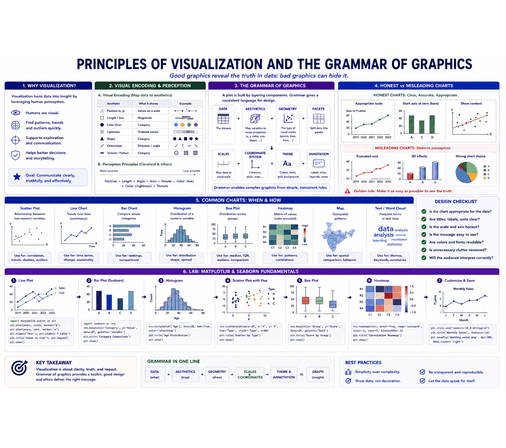
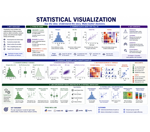
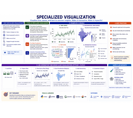
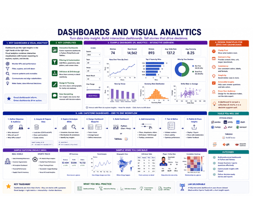
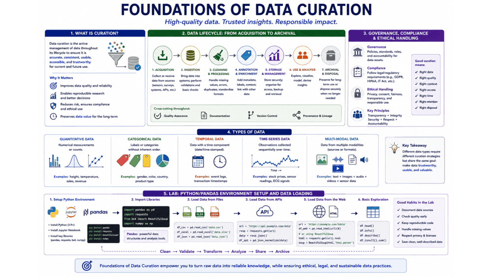
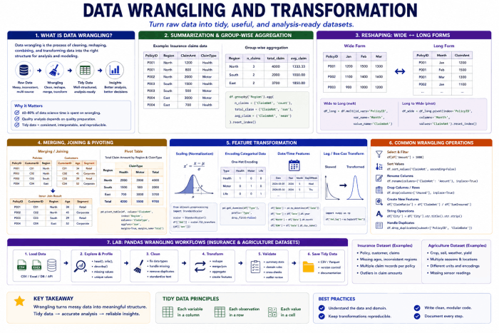
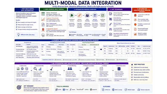
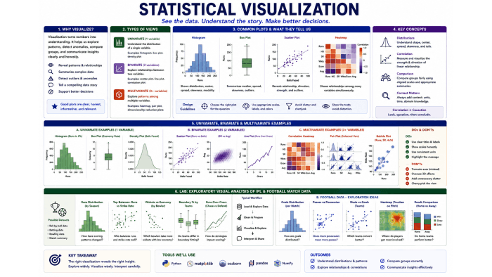
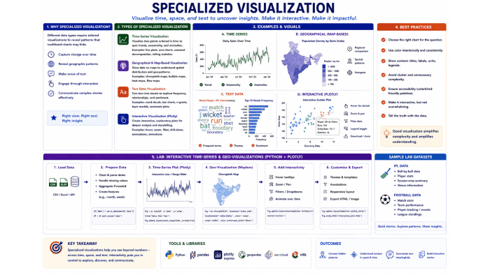
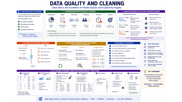
Data Curation and Visualization is a rigorous study of how raw, imperfect data is transformed into reliable evidence and communicated with clarity. The course delves into the acquisition, cleaning, and integration of real-world datasets, including data lifecycle management and governance, handling of missing values and outliers, wrangling and multi-modal integration, the grammar of graphics, statistical and multivariate visualization, time-series, geographical and text data, and interactive dashboards built with Python and Tableau. It challenges participants to curate data with discipline while critically examining what a visualization reveals, what it conceals, and how honestly it represents the underlying data.

Lectures
Projects
End Semester
Laboratories
Information is the oil of the 21st century, and analytics is the combustion engine.

Torture the data, and it will confess to anything

"Errors using inadequate data are much less than those using no data at all."
| # | Topic | |
|---|---|---|
| 1 | Monday (Laboratory) | 14:00 - 17:10 |
| 2 | Thursday | 15:00 - 16:40 |
| # | Assessment | Marks | Topics |
|---|---|---|---|
| 1 | Test 1 | 15 | Up to Topics Covered on 3rd September 2026 |
| 2 | Test 2 | 15 | Up to Topics Covered on 8th October 2026 |
| 3 | Projects | 30 | 10 Projects |
| 3 | End Semester | 40 | End Semester (Theory + Practical) |
| # | Project Theme | Datasets | Instruction | Google Sheet | Date |
|---|---|---|---|---|---|
| 1 | IIT Timetable and Slot Systems | Link | Link | Link | 03-08-2026 |
| 2 | NIRF Data | Link | Link | Link | 10-08-2026 |
| 3 | UIDAI Data Hackathon | Link | In Colab | In Colab | 17-08-2026 |
| 4 | Ad Click Info | Link | In Colab | In Colab | 24-08-2026 |
| 5 | Uber Dataset | Link | In Colab | In Colab | 31-08-2026 |
| 6 | Air Line Data Set | Link | In Colab | In Colab | 31-08-2026 |
| 7 | Types of Data | Link | In Colab | In Colab | 19-09-2026 |

Associate Professor

In case of any doubts, please write to panch.m@iittp.ac.in or meet me in my office room during my office hours
Disclaimer: Contents in this website may have some typos or errors. So, please use it with caution. Some corrections are spelled out during lecture hours. In case, if you find any, please write to panch.m@iittp.ac.in